Case Study: "Salt"

How to Get the "Look and Feel" of "Salt".


This type of layout is perfect for a portrait, or a character poster.

The black gradient at the bottom gives an edge and allows the text to really "pop".
The title treatment suggests that the character is multi-dimenional and gives a sense of "grandeur" and story telling.


Easy Movie Poster - Look And Feel - Salt - Case Study

CHOOSE your TEMPLATE


For this case study, we are going to use this Movie Poster Template.

It definitely provides a good environment for a portrait poster. It comes with a semi-transparent gradient at the bottom, which will make the portrait fade into darkness while supporting the white text. It is also very simple and easy to customize.


Easy Movie Poster - Look And Feel - Salt - Case Study

UPLOAD your IMAGE


Start by uploading your image.

For optimum effect, use a shot where the character is facing the camera. There should be an intensity in the expression, yet not too much: it should be subtle in order to get that "Mona Lisa" effect, where we are not sure if she is smiling or not at all. Also, a well-lit shot will provide more dimension, as too much shadow may rapidly turn into a scary effect.

See how the black gardient works here? The facial expression is really brighter and coming forward.


Easy Movie Poster - Look And Feel - Salt - Case Study

TIP: Use the grid to position your picture precisely.
In this type of design, it helps to have the character centered, the eyes are positioned at the key intersections of the 3rds and the 4ths of the composition. The mouth comes right below the center.
All this can be fine tuned later, but it always help to start with some solid fundation.
By the way, the subject of our case study is NOT centered in the design, whic cretes a sense of movement. In our version, it is the hair wave on one side that creates a sense of movement.


CUSTOMIZE the TEXT


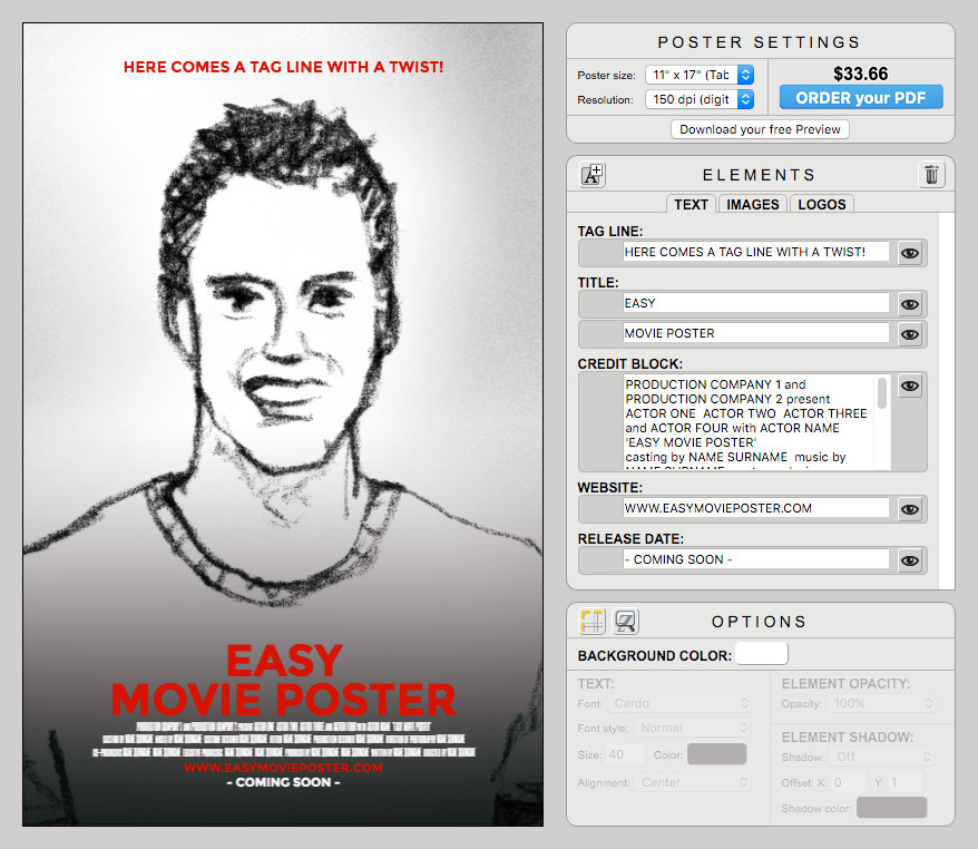
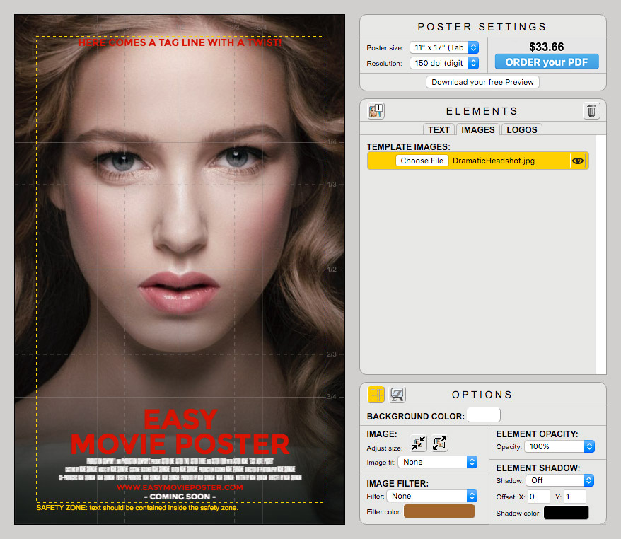
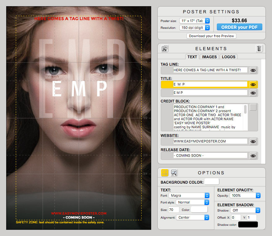
Simplify: in this design we are not going to use the Credit Block, so you can turn it off right away.

The fonts we are going to use is MAGRA, except for the transparent Title which will use SIX CAPS.
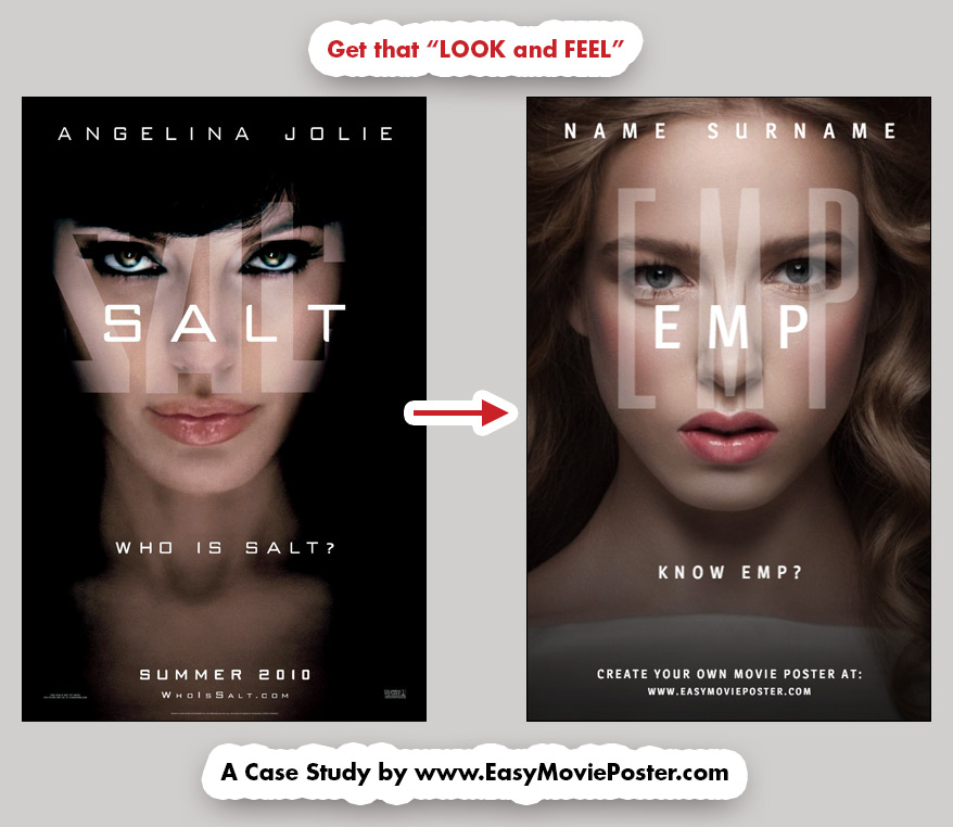
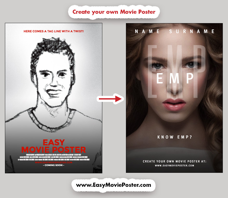
To create the wide spacing in the text, add one "space" between each letter, and make sure there's 3 "spaces" between each word. For instance "EMP" becomes "E  M  P".


TITLE:

Let's start with the Transparent Title.
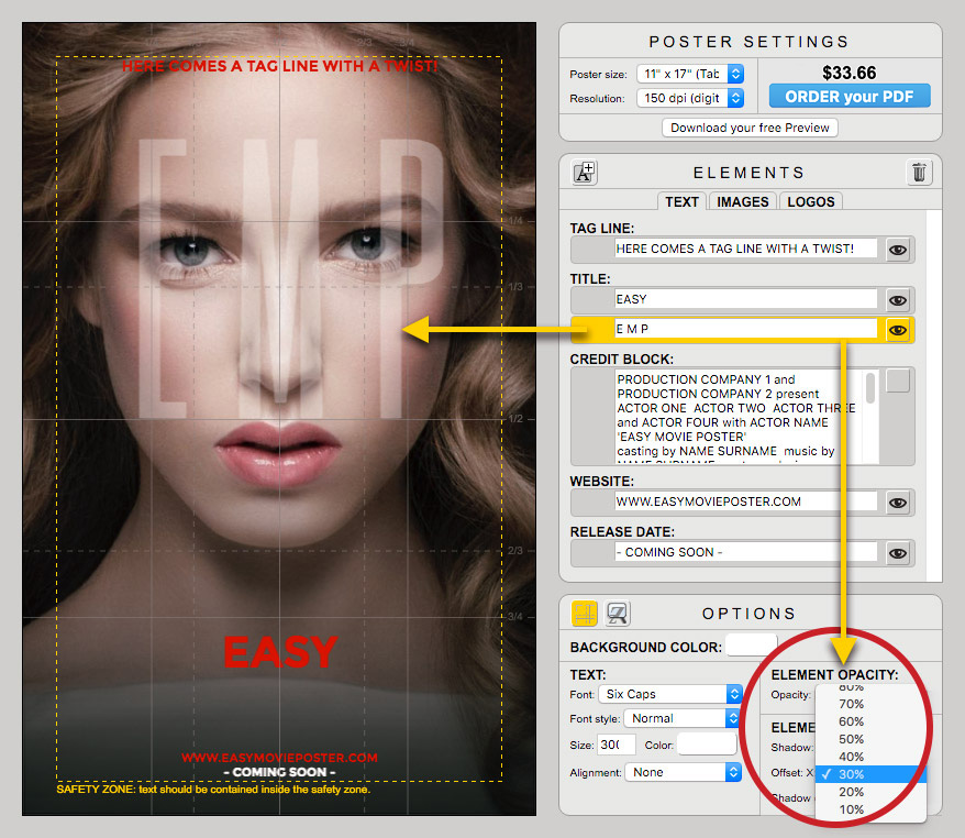
We are going to use the font SIX CAPS, for it is quite symetrical and so narrow we can easily increase its size.
Position the text carefully, as it should act like a mask: the character is hiding beind it, yet the eyes must stay piercing. Adjust the transparency so that it stays readable, yet it should not be prominent at all. 30-40% Opacity should give you a good starting point. You can always fine-tune this later.


Easy Movie Poster - Look And Feel - Salt - Case Study

Next, let's work on the Opaque Title.
Enter your text, change the font, size and color, and move the Element all the way up between the eyes and the tip of the nose. You want to find a place where the Title is connected with the other elements, is readable, and does not conflict with the image in the background.

TIP: The Elements stack up in the order your find them in the Elements Palette: which ever Element is on top there, is going to be on top of your canvas. Keep that in mind when you overlay typographic elements.
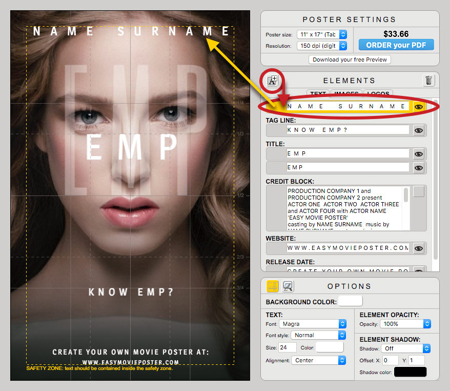
Easy Movie Poster - Look And Feel - Salt - Case Study


TEXT:

Prepare every other text section using the same principles.
To add a new text field for the Talent's name: click on the upper left icon in the ELEMENTS palette, and customize it as usual.


Easy Movie Poster - Look And Feel - Salt - Case Study

SPECIAL EFFECTS


IMAGE FILTER and ELEMENT OPACITY:

To create a bit more contrast and depth, you can try to play with the Filter Option.

In this exemple, the same image has been uploaded a second time, and positionned at the exact same size and place than the one we had so far.
Then, the Option OVERLAY with a very dark brown color has been applied, and the Element's Opcaity has been lowered to 70%.
You will have to play around with the options to see what works best for your picture.


Easy Movie Poster - Look And Feel - Salt - Case Study

ORDER your PDF


When you are ready, simply click on ORDER YOUR PDF to place your order.

Once your order is finalized, your elements will be gathered, and your poster will be rendered and emailed back to you.


Easy Movie Poster - Look And Feel - Salt - Case Study

NOW it's YOUR TURN!


CREATE YOUR OWN VERSION:
We made it easy for you with a version of our Movie Poster Template where we prepared most of the elements according to our case study...so you can have fun with this "look and feel" right away!


Easy Movie Poster - Look And Feel - Salt - Case Study

Ressources:

• Link to: "Salt" page on IMDb.
• Link to: the Movie Poster Template we used as a starting point in this case study.

Need a bit more help?

• Check out: our Getting Started page, and watch the short video for a crash course on how to use Easy Movie Poster™.
• For more detailed tips, check out our User Manual.
• If you still need more help or can't find what you are looking for, feel free to contact us. We'd be happy to help!

Have fun, and happy designs!


Browse our Movie Poster Templates and start your own design!